Power BI & Qlik
Dashboards and analyses that provide the information you need to steer daily work and strategy.

Clear management information starts with reliable data and reports that fit the way people work. BI Result helps make insights usable, from data source to Power BI dashboard.
A good dashboard is the result of reliable data, a thoughtful model and reporting that matches the user's question.
Dashboards and analyses that provide the information you need to steer daily work and strategy.
Connect sources and organize data logically so definitions and figures align across reports.
Practical solutions and Power BI visuals that make reports easier, more compact and more pleasant to use.
We first clarify which information helps people do their work. Then we build step by step toward a reliable and usable solution.
What do you want to see, explain or decide? We make the information need concrete.
We look at sources, definitions and the structure behind the numbers.
We create reporting that answers the question and fits the user.
Based on usage and feedback, the solution can grow with the organization.
Custom visuals that make Power BI reports clearer and easier to use.
Each visual has its own page with explanation, use cases and a demo request.
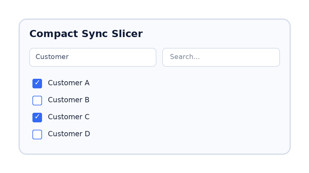
A compact slicer for Power BI reports with many filters. Users can search quickly, select directly and preserve valuable report space.
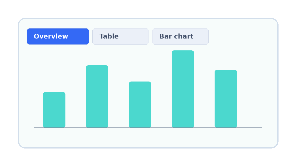
A visual that lets users switch between different views in the same report area, such as table, pivot table, chart or donut.
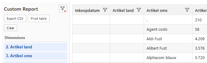
A self-service table or pivot table for Power BI, with column-level filtering. Users can analyze directly without needing a new report page every time.
Briefly tell us what you are running into or which information you want to use better. Then we can look at the right next step together.
Send an email